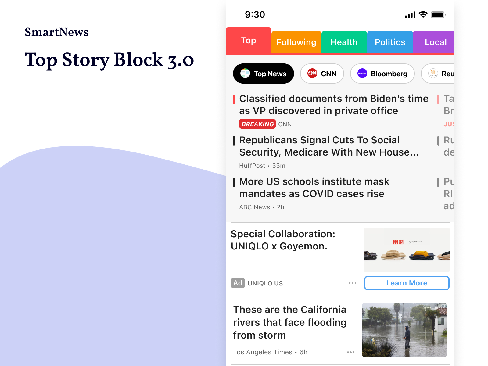
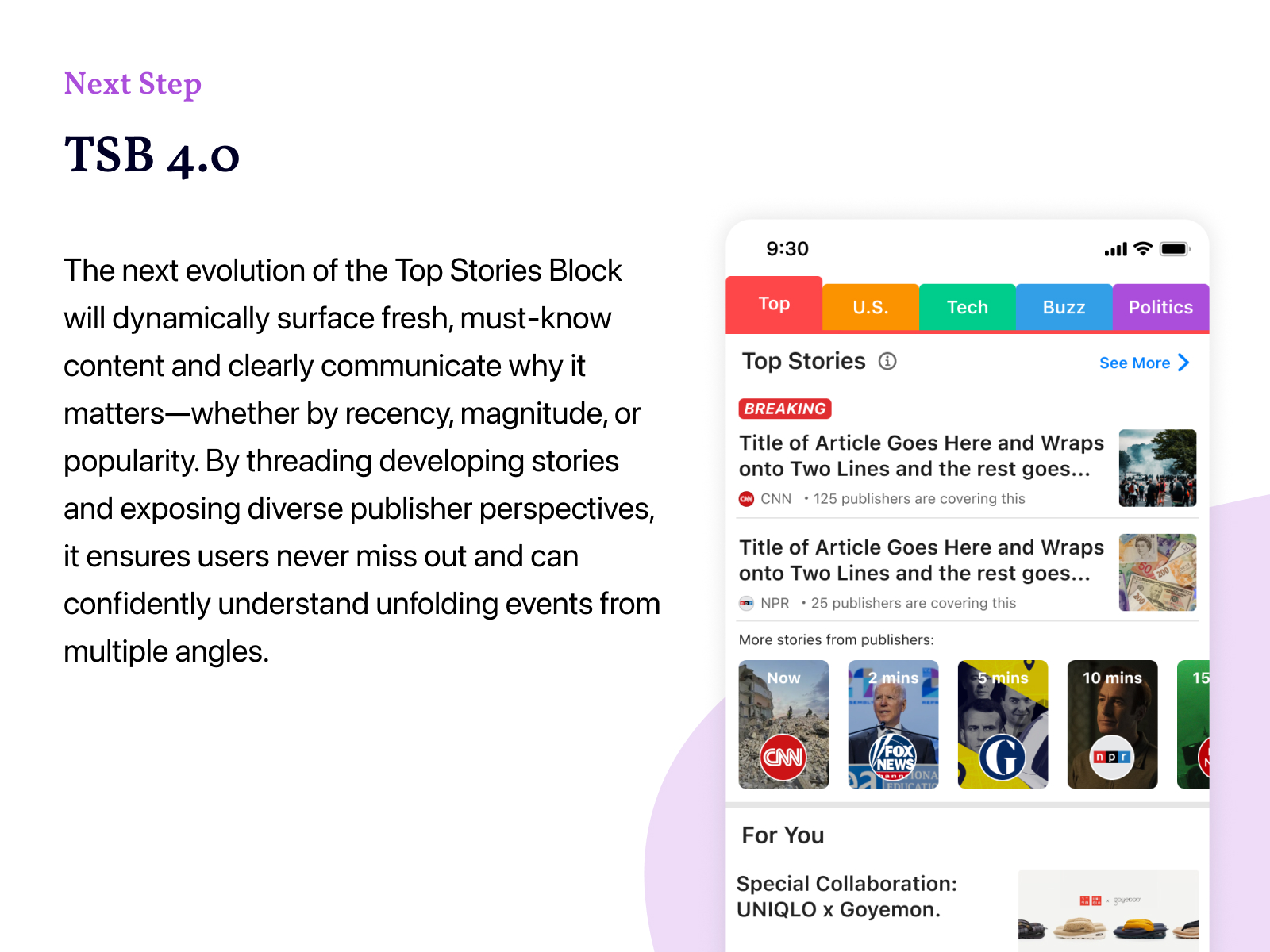
Top Story Block 3.0
Top Stories Block (TSB) 3.0 was designed to make SmartNews the first stop for news-conscious users to catch up on the day’s must-know stories. Sitting at the very top of the home page, it delivers a real-time, comprehensive, and easy-to-scan view of what’s happening now—helping users feel instantly informed and confident without needing to check multiple sources.
My Role
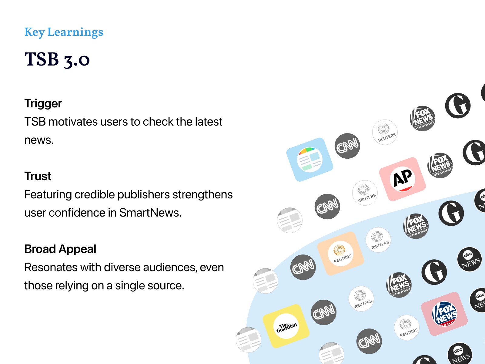
As the Lead Designer, I collaborated with PMs, engineers, and data scientists to redefine how SmartNews presents essential news on its main page. The team initially debated two directions—whether TSB should go deep into one story or go wide by showing multiple key headlines. Through user research, I confirmed that users preferred a broad, scannable overview. I then led the design to simplify the UI, removing thumbnails and using bullet-point headlines to maximize the number of visible stories. I also introduced layouts that highlighted diverse news sources, reinforcing user trust in SmartNews as a balanced platform.
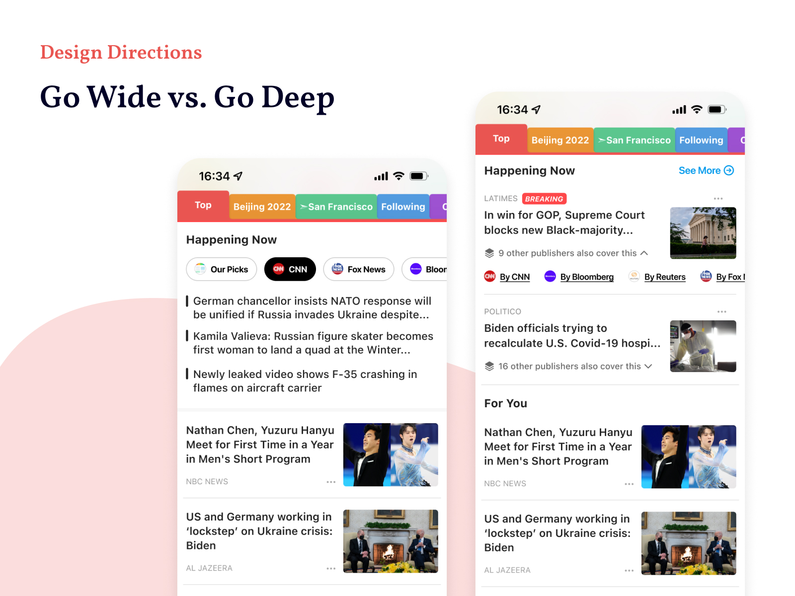

The design challenge centered on balance. Because the Top Stories Block appears on the landing page, any change in its height directly affected user engagement with personalized content below. Expanding the section could make users feel more informed, but it risked pushing the personalized feed too far down—potentially lowering time spent and click-through rate. The solution was to design a compact yet information-dense module that displayed multiple stories clearly, allowing users to absorb more at a glance without overwhelming the layout.
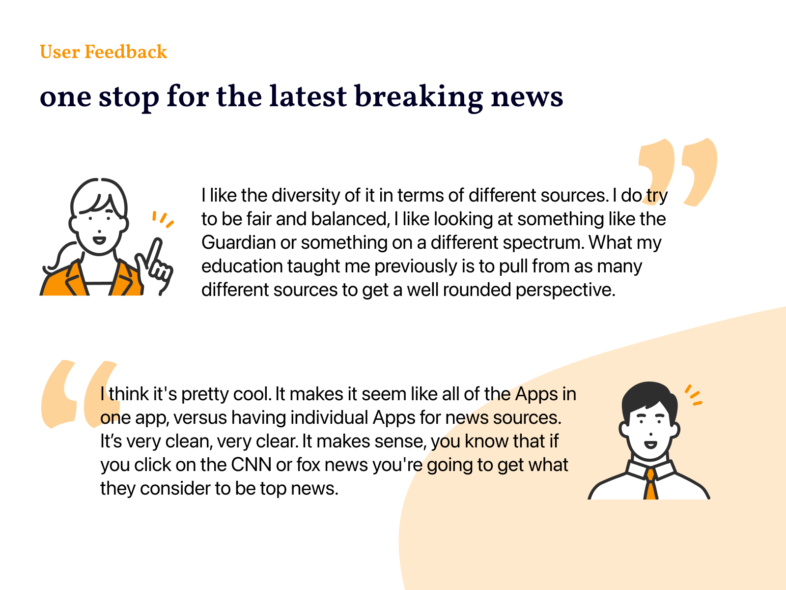
User testing and A/B experiments validated this approach. People consistently expressed that TSB 3.0 made it easier to stay current:
“I like having all my news in one place.”
“It feels like all the apps in one app.”
“I can see different takes on the same story—it feels fair.”
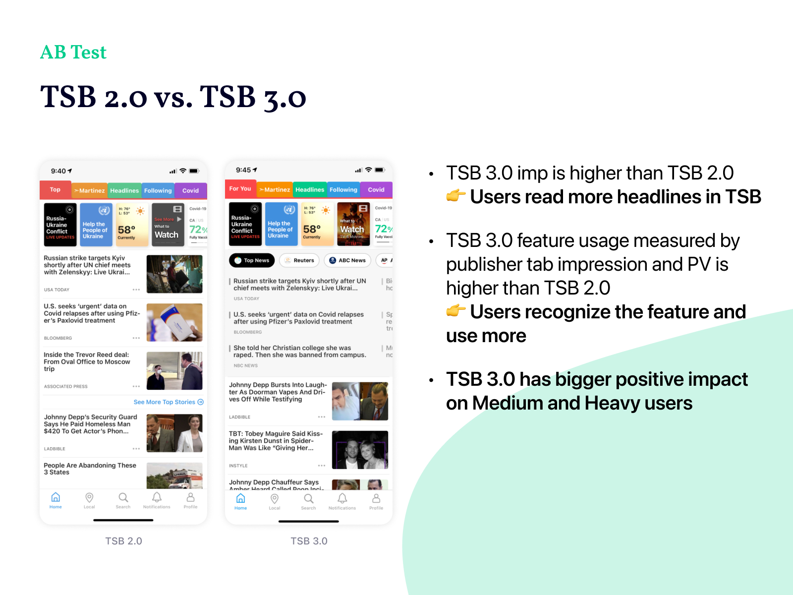
Performance metrics reinforced these insights. For new users, pageviews increased by +10%, total sessions by +3%, and time spent by +6%. More importantly, the redesign changed user perception—SmartNews began to be seen not just as a feed of personalized stories, but as a trusted hub for essential, balanced news.
TSB 3.0 became a cornerstone feature that defined the app’s identity in the U.S. market. It showed that good design could bridge user needs and business goals—delivering clarity, credibility, and measurable engagement, all within a single, well-crafted experience.
Check on SmartNews US